
So, shall we begin?
The original screencap:
Of course, you first have to crop your image. I wanted to go with her eyes and neck first, but that didn't work out well, so I only cropped it above her lips.

again, brighten the mga kulay up if you wish. I always prefer duplicating the layer and setting it on screen, then again to soft light with different opacities.
Like I said, I made this for an 'air' theme, so what I had in mind was not a very bright coloured picture, yet not a b&w one, either. So, of course, I used a vibrance layer.
Vibrance: 0, Saturarion: -49.
To dull it up even more, I used a color balance layer. The only thing I changed was the first slider in midtones. I set it to -9.
I guess here I decided to go for a different technique and pumped up the saturation. I did that sa pamamagitan ng making a new Hue/Sat layer and setting the saturation to +23.
Then, to bring out her neck, I created a brightness/contrast layer and set the contrast to +41.
I then used one of my paborito adjustment layers, color balance. I pag-ibig it because it can bring out colours of the colours that you want. I prefer it to colour balance layers because it's way madami precise, but I don't back down from colour balance, either.
Anyways, I selected the 'yellows' preset and set the magenta to +19 and yellow to +29. Next, I added a vibrance layer.
Vibrance: +54, Saturation: +15.
A brightness/contrast layer.
Contrast: 28.
A gradient map.
First colour: #5357a4 segundo colour: #adcde4.
A levels layer:
8, 1.62, 255
I masked (or erased, if you prefer) it away from her neck and only kept it on her hair.
And here comes the fun part; painting.
I first made a new layer, then selected a dark brown colour (#1f0808) and painted it on the left side of her face and neck.

I set it to soft light, 51% opacity
I'll just let the pictures speak for themselves here. The settings of the layer are the same for every one. (soft light, 51 % opacity). Each colour has a different layer.

#8c5928

#d2668a

after changing the layer settings

stamp layers, sharpen, set to 44% opacity
Another really fun part: variations. Stamp the layers again and go to Image > Adjustments > Variations. Click on 'original', then on cyan, magenta, green, blue in that order. Make sure it's set on midtones and the slider is exactly in the middle.

This gave it a nice, glowing look.
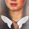
Afterwards, I used another texture of these pretty little wings, set it on screen and 86% opacity, and moved it near her necklace.

|
v
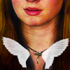
I guess the reason I did that was because I couldn't get the mga kulay I wanted into the icon for it to fit 'air', but when I did this I also realized the icon didn't look exactly good. So I came to textures for help, and these little guys helped me.
First, I used this texture.

screen, 54% opacity, masked/erased the tuktok left corner white blobs that go too much to the middle
Then this one (I resized it to fit my canvas: 100x100)

screen 49% opacity, 56% fill.
And that's it.

OPTIONAL
When I looked at the icon again earlier, the sharpening above her mouth couldn't stop bugging me, so I sharpened it again. You do the same if you are having this problem.
Stamp the layers, go to filter > sharpen > smart sharpen, and set whatever you prefer as long as the 'reduce noise' slider is high, this makes the icon seem sharpened and soft all at once. I just pag-ibig this feature.
However, it does not always help completely. This is where the smudge tool is useful. For those of you who don't know, the smudge tool is on the left toolbar of photoshop. Below the bucket tool is the blur tool. Right click that and choose 'smudge tool' from the menu that pops up.
Then, stamp the layers again, zoom in really well to the part you want to get rid of, set the size to about 6px, strength to 50%, and begin smudging sa pamamagitan ng simply painting on it like with a brush. Don't smudge too much, though, it will distort your icon. Don't smudge the same place madami than once. If you've made a mistake, go back and do it all over again. Don't attempt to fix it sa pamamagitan ng smudging it more.

Voila
The End.
If you have any questions, do ask me.


I mean isn't he fucking smokin'?
This was actually complicated. I initially wanted to make it a blue icon, but had no luck with that, but I think it turned out pretty good in the end. I may have also been distracted sa pamamagitan ng the absolute hotness in the icon...ahem...
Okay, so first I took the center image of this and cropped it.
And after giving up on making it blue, I deeply sighed and created a curves layer.
Input: 127 Output: 128
It only changed the icon a bit, but I was just so done I was glad even for that.
I added a vibrance layer.
Vibrance: +50, Saturation: +20
I stamped the layers and used variations. I attempted using blue...
continue reading...
Okay, so first I took the center image of this and cropped it.
And after giving up on making it blue, I deeply sighed and created a curves layer.
Input: 127 Output: 128
It only changed the icon a bit, but I was just so done I was glad even for that.
I added a vibrance layer.
Vibrance: +50, Saturation: +20
I stamped the layers and used variations. I attempted using blue...

"So, Westeros. It's not exactly like our universe. It's more.. medieval. Can't explain. Nevertheless, we've got lots to do there and we will be staying for a while."

The Doctor took that as a yes and opened the doors to the grim future.
Jackson and Diana were in the cafeteria still, laughing at their high school memories.
"And this one time, Derek and Stiles-", Jackson couldn't even finish his sentence with all the laughing. Diana was having a time of her life, and she couldn't help but to wish she could feel like this madami often. She truly, truly liked Jackson.

"I think I would fit in well at your group", she sinabi after she'd stopped laughing.
"It's not really a group, but you would", Jackson agreed. "A witch would fit right in."
"I'm not a witch", Diana snapped. "Not really....
continue reading...
"And this one time, Derek and Stiles-", Jackson couldn't even finish his sentence with all the laughing. Diana was having a time of her life, and she couldn't help but to wish she could feel like this madami often. She truly, truly liked Jackson.
"I'd like to see you at your craziest"
"I think I would fit in well at your group", she sinabi after she'd stopped laughing.
"It's not really a group, but you would", Jackson agreed. "A witch would fit right in."
"I'm not a witch", Diana snapped. "Not really....