

EXACTLY! So let us have all criticism in one place and then I will send them a link and maybe they have time to read our thoughts.
All in all I think we need to remember that fanpop is a business. Some of the changes made are sometimes business descisions: I remember how I hated the "popular content" module and then papa explained how it helped the paghahanap Engine Optimization and now I just ignore it, knowing it is keeping fanpop busy and alive!
1) The black swoosh of doom.
As I have sinabi earlier I think it's badly executed (Sorry to whoever made it) and doesn't actually add to the site disensyo so I think this can be removed.
2) Color Coding on quizzes
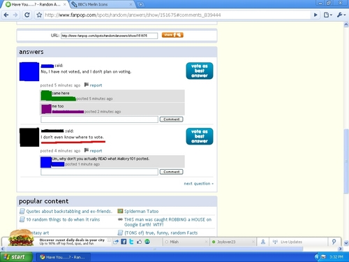
I liked the way the iksamen results were color coded in green and red for an "at a glance" view of correct vs incorrect.
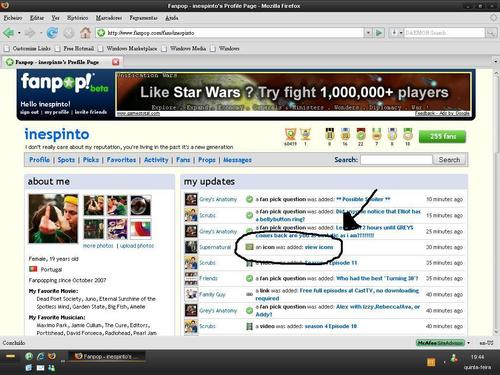
3) Making an "add content" button that is the same on all content
Right now we have an "add video/image" feature ONLY on the first page of videos, pictures etc
I think it would be better to have that option in the blue bar on the video/image itself when having chosen one. If I am looking at a video and want to add my own I have to navigate back to the video page- or am I missing something?
4) Shades of Grey
I find that all the grey tabs are not really helping me to distinguish between the different features. There is a lot of information on a page and I do like the new graphics (flame for what's hot, a wall, the little camera) but I feel there is too many gray buttons that I can't really sort when looking at a page. Possibly a compromise would be to keep the grey buttons but make the symbol a certain color.
Also all text is now in grey and it makes it harder to read (I think anyway) It's a dark grey on a light grey OR grey on white. I would make it darker or just plain black which has served as a good color for text for many years now. It would stand oot madami and increase readability.
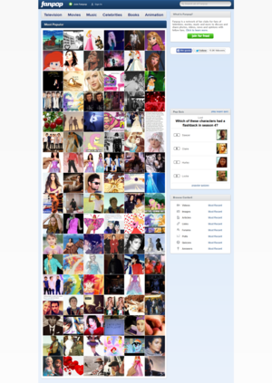
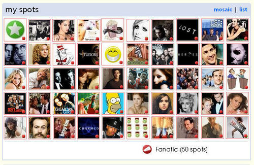
5) Smaller icons for spots/profiles
Right now the icon is cutting off the "y" of the tuktok line asking "What are you a tagahanga of?" AND IT IS DRIVING ME NUTS. Either the icon needs to be smaller (why is it larger than the banner?)or the tuktok fanpop logo needs to be higher. The icon is now also cutting into the two lower "home" and "wall" buttons and it just looks....weird!? It's just a small thing ..or rather NOT small enough..but I see it every.time.I.look.at.a.page! MAKE IT STOP!
6) "Get to know this user" option
I see how a lot of bista sa tagiliran information seems busy and cluttered but maybe the bista sa tagiliran information could come back but be hidden behind a "find oot more" link. This would possibly open up an additional section of the information window and tell you aboot likes/dislikes/hobbies/movies etc like we had before.
7) Customization
So many people have been asking for blinking shit and myspacey music playing on their profile...I will not go there. But I do see how the new bista sa tagiliran could be easily customized with a tuktok picture in the banner and possibly the option to change colors?
The four "caps,medals,fans,props" buttons could be smaller and ilipat to the bista sa tagiliran box. This way a customized banner could be added.
So, my lovelies, write your opinions and ideas in the comments below and rest assured that the F4 are known to be awesome!
P.S. Why won't the image go where I tell it to go?

Additional "add content" button here