


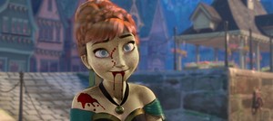
We'll be excluding Frozen in this countdown.
1) The disensyo (including layout and color scheme)
2) Intrigue (the strategy involved in "selling" the film, or influencing moviegoers to see it; includes the design, tagline, and impression)
3) Reflection of the film (how accurate of a representation the poster is of the movie it's advertising)
I'm attempting to look at each category objectively, but that may be difficult for the third one. My perception of each DP film (and thus how well I think their posters match up) may be different from your own, but even so, I hope that you enjoy pagbaba and possibly enjoy these posters on a greater level!
The Lower Scores (between 1 and 10 points)
I wound up using a 6-point system to score each category, resulting in a maximum of 18 total points. Here we start with the low-scorers.

One thing to keep in mind is how the disensyo of posters has changed over time, so the art style for the older ones is different from what we're used to nowadays. With that said, I find the Sleeping Beauty poster to be rather dull, though there are a few good things to address.
For starters, there is a bit of creativity with the design. It has the major and supporting characters "lined up" to form a semi-circle, with Aurora in her signature sleeping pose (if you can call it that) as the focus. Unfortunately, it looks a bit crowded and even uninspired. What easier way to fill up a poster than sa pamamagitan ng just ipinapakita all of the characters? Sometimes this can be executed well, but here, there's simply nothing that special aside from the way the characters are arranged. This is also a major reason why there's not that much intrigue for this film from the poster alone -- it looks uninspired. The tagline doesn't help its case either, simply telling us that it's "Wondrous to see...Glorious to hear..." and "A magnificent new motion picture!" Whether you feel these are true about the movie or not, it doesn't seem like there was a lot of creativity when coming up with a way to promote it.
The final aspect refers to how well the poster reflects the movie. Perhaps the one good thing about featuring so many characters is how the mga engkanto and the villain (who get the most screentime) are shown and ibingiay a fair amount of puwang on the poster. It also shows enough for us to get an idea of the setting as well as the genre, that being fantasy/fairy tale. However, the slew of characters kind of takes you out of what should be a madami majestic feel, meaning that Sleeping Beauty's poster is perhaps the weakest of all.

Who am I kidding? You knew this one was going to be down here. Gusot is infamous for its misleading advertising, playing up the movie to be far madami silly than it actually is, and the poster suffers as a result.
The poster is generic for sure, but not awful. It features the main characters and the two "sidekicks," who make up the group that sets out on the adventure. It shows them all in epic poses and with that signature raised eyebrow you see in so many animated films these days, which again emphasizes the movie's silly nature that was overexposed in its marketing. Even so, the characters chosen to be in the spotlight were likely the correct choices, and there's the added bonus of the poster featuring one of the major locations in the movie, that being the tower.
Although the poster doesn't do the best job of reflecting the film, you do have to give it credit for the intrigue it creates. It may not look super mysterious or interesting, but it plays up the comical road-trip adventure aspect big time. The characters' epic poses, raised eyebrows, and that tagline "They're taking adventure to new lengths" are the greatest pieces of evidence. Disney had a clear strategy for marketing the movie, and this poster, great or not, creates just the intrigue needed to bring in family audiences, putting Tangled's poster just slightly above Sleeping Beauty's.
The Middle Scores (between 10 and 15 points)
With Gusot earning a score of just six points, we're making quite a leap here from 10th to 9th place.
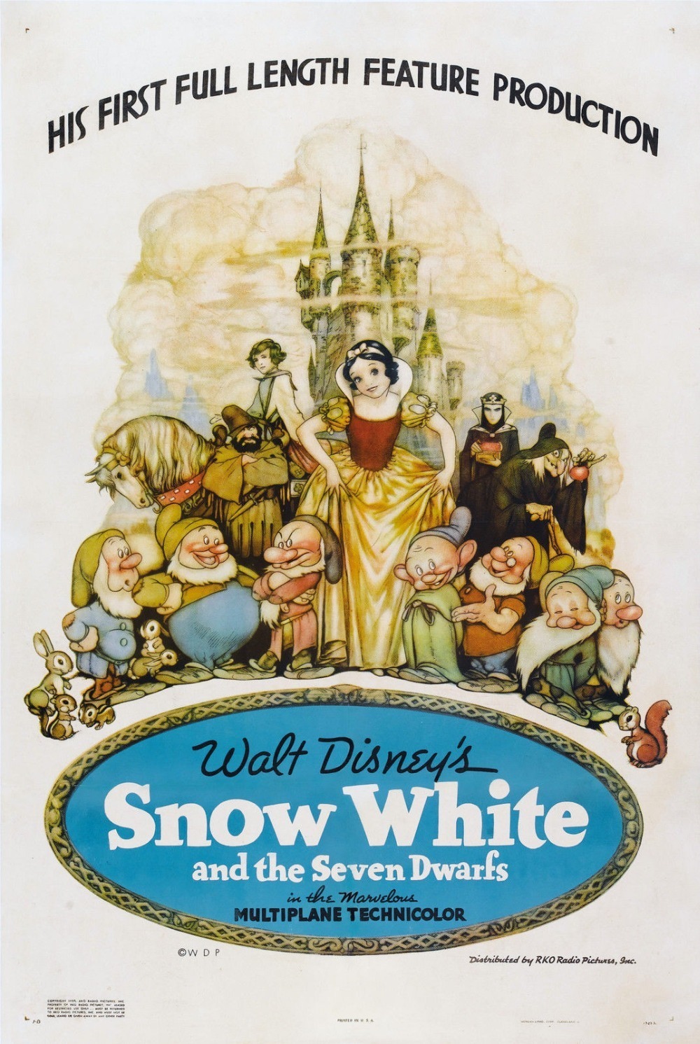
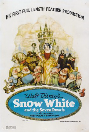
Being the first animated feature film, I'd imagine it was difficult figuring out how to successfully market this movie, ibingiay the skepticism of the general public at the time. With that in mind, you have to give major pagpaparangal for this poster. The disensyo is kept simple, but shows us just enough. All of the major characters are centered on the poster, with Snow White of course being in the spotlight. The coloring is rather light, which gives it a bit of flair. That and the display of golden clouds in the background somewhat reflect the tail end of the movie, making it appear mystical.
When it comes to promoting the film, the poster took an admirable approach. There wasn't really a gimmick; it shows us exactly what the movie is -- an adaptation of Snow White. The tagline is simply "His [Walt Disney's] First Full Length Feature Production." It being so straightforward also makes it easy to say that the poster does reflect the movie fairly well, since it gives us exactly what it promises. The character designs are a little different, though I'm assuming that's due to style and/or it possibly reflecting concept art. It's merely an observation. The pangkalahatang simplicity is something to admire about this one.
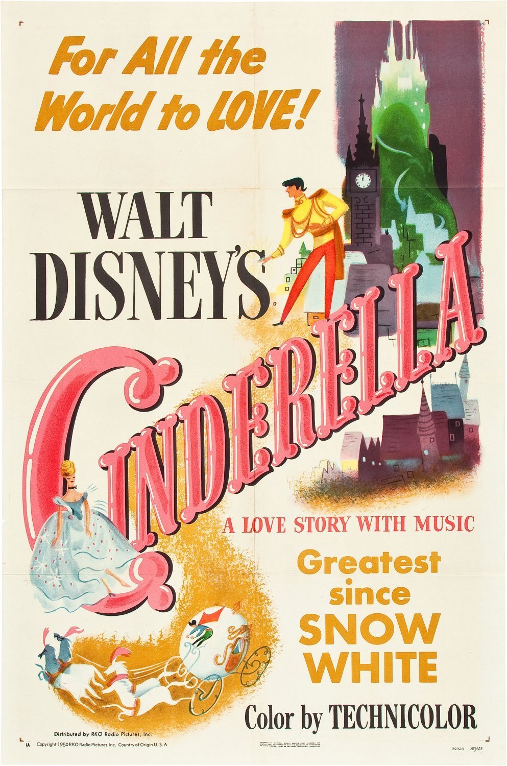
This poster has an interesting layout. Cinderella, in her ballgown, is shown with her carriage in the lower left while the prince and his kastilyo are towards the upper right. The designs seem to be based on the concept art, which is similar to Snow White's poster and is a nice touch. Also of note is the color scheme. The poster mainly utilizes gold, pink, and traces of blue and purple. The contrast really helps it come to life.
The film is promoted as "a pag-ibig story with music," one "for all the world to love." This along with the classy disensyo create a fair sense of intrigue, but do they accurately reflect the movie? Despite the concept-based designs, I'd say that the appearance of the poster does a fair job, but the promotion of it being mostly a pag-ibig story is somewhat debatable. While romance is a major element here, Sinderella and the prince only spend a song and a few short lines together before they marry. In other words, we don't see them interact (and thus fall in love/be in love) very much. And if you'll notice, neither Cinderella's step-family nor her animal mga kaibigan can be seen anywhere (aside from the mice as the horses for the coach). It's not too major of a problem since the romance is ultimately what saves her, and the studio had to promote the film carefully due to the critical financial situation they were in at the time. The pag-ibig story itself isn't elaborate, but it's definitely there, setting this poster at 8th place on the list.
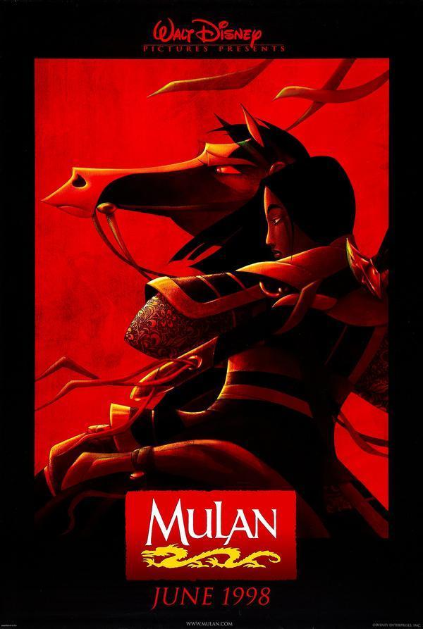
Epic poster, right? While that's true, that could be where the problem lies. Let's take a look at the design. The only characters shown are Mulan and her horse, the latter not even being a "major" character. But boy, the way they look together is pretty amazing. Mulan comes across as a fierce warrior (which you could argue she is) and the horse as a strong companion. The poster mainly utilizes red and black for its color scheme, possibly using red to reflect the Chinese influences of the film, giving a bold look. While the contrast is great, it's not exactly easy to look at, as in it doesn't have the softness that the nakaraan ones have. Then again, maybe it shouldn't.
The poster is definitely intriguing for its disensyo alone, which is good because there doesn't appear to be a tagline (not that it needs one). The reason this doesn't rank higher is because -- and madala with me, this is just how I see it -- it suggests madami "epic" than there actually is. The movie has a comedic element which isn't highlighted here, and although Mulan really pulls through in some action scenes (especially the climax), the poster sells her being a warrior without touching on her internal conflict, addressed in her song "Reflection". Mulan is a great character because she's fearless in the sense that she fights even when she's afraid, and motivates herself to succeed. Here she looks as though she's fearless in a madami literal sense, as in she ISN'T afraid whatsoever. It does make the poster look great, but it doesn't reflect her actual character and subsequently her major scenes super well. Essentially it's a mixed bag -- there's some definite greatness, but also some "moderate" and "good" things, bringing it down a bit.
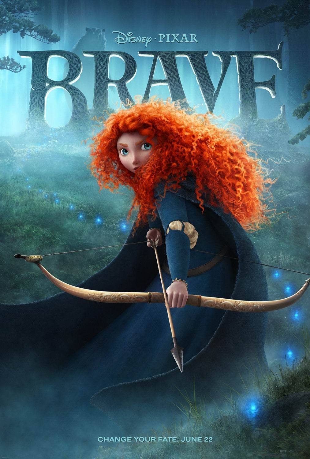
Brave's theatrical poster suffers from a similar problem, though it's slightly less of an issue here (hence only a 0.5 point difference). There's only one major player here, and that's our protagonist Merida. The villain can be seen behind the title, which you might not notice at first glance, but it does add some intrigue in addition to what the rest of the poster offers. Contrast again serves well, with blues and greens dominating the color scheme until you see Merida's red locks. They chose a swell character disensyo for her because she looks stunning here, and her facing the camera with her bow drawn adds some extra points. Once again, the disensyo practically sells the film, though the tagline "Change your fate" does help. It also helps that this is a major theme of the movie, meaning that and the presence of the wisps suggest the poster accurately reflects the movie...but only to an extent.
The problem here is that the poster is a pretty accurate representation of what you can expect from the first act of the movie, but once the major plot twist occurs, the film loses some of that "epic" vibe it had going. That's really the only strike against it because the design, though simple, looks great and sells the movie. If bravo had followed up on the atmosphere that the first act set up, this poster could very well have been ranked higher.
The Higher Scores (between 15 and 18 points)
We've reached the final bracket, and it turns out that this is our tuktok five! Keep in mind how close these scores are to each other; they're all quite great.
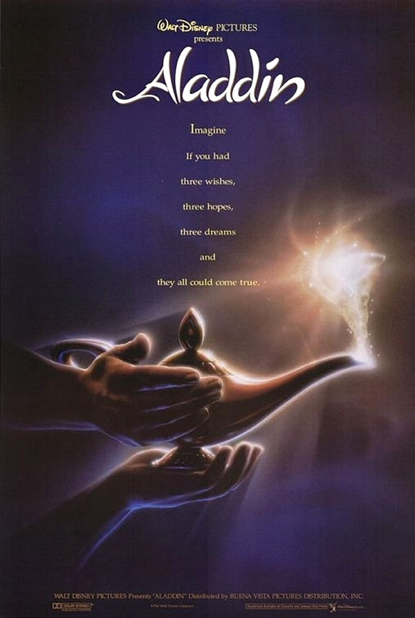
Here's the only DP movie poster to have not characters at the center of attention, but rather an icon of the film. Someone (presumably Aladdin) is rubbing the lamp, resulting in that bit of magical light leaving the spout. Purple and gold, being opposite colors, contrast quite nicely here, leading to an equally-nice contrast of light and shadow. As if that wasn't enough, you have this great tag: "Imagine if you had three wishes, three hopes, three dreams and they all could come true." It sets you up for the genie's character introduction and the choices Aladdin will make sa pamamagitan ng asking you to imagine yourself in the situation. And do you know why no character's face is shown? Yep, you're supposed to be imagining yourself holding the lamp in the poster! Clever, right? It's not a bad way to interest a moviegoer, especially with the mystery behind the light coming out of the lamp and the color contrast to boot.
The poster appears sophisticated, though the movie has a madami lighthearted nature than is shown here. The "scene" shown probably best fits when Aladdin first picks up the lamp in terms of the look and feel. It doesn't fit too well with the rest of the movie, but the aforementioned scene might be enough to warrant it as doing at least a good job in that respect. The design, again, is simply great and brings in enough interest for the film.
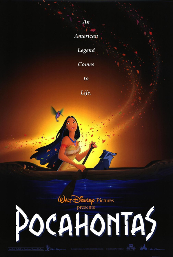
I didn't think much of this poster before, but now I see it as one of the greats. What helps is that it reflects two of the movie's most popular songs, both of which are sung sa pamamagitan ng Pocahontas, who just happens to be the central figure of the poster, who just HAPPENS to be what the film is named after! The shot of her canoeing at the start of "Just Around the Riverbend" is here (perhaps just slightly edited?), with a trail of leaves -- an icon of "Colors of the Wind" -- blowing in the breeze behind her, all amidst a sunrise/sunset background. The poster manages to capture the beauty and epicness of at least two major scenes from the movie, and it sure looks amazing! You might think that the smiles on the characters' faces take you out of it, but I think it works to the poster's advantage, at least in terms of how well it mirrors the film. The setting and disensyo give it a grand feeling, but the characters ipakita that it has a lighthearted side as well.
The look of the poster is enough to sell the movie, but once again, the tagline does help its cause: "An American legend comes to life." It's short & sweet and also promises this feeling of something grand as I mentioned before. It all comes together quite nicely.
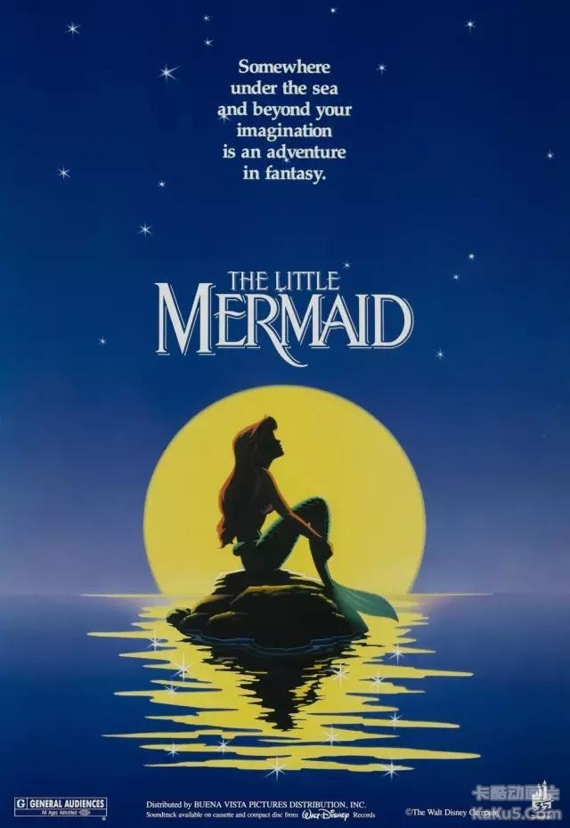
The Little Mermaid also has a simple yet sophisticated poster, though this one ranks higher because of its greater sense of wonder. Ariel (in her mermaid form) is shown sitting on a rock against the moonlight, looking up at the stars. Much intrigue is created though that moonlight, which intentionally makes it difficult for us to see Ariel's facial features. It's meant to appear madami like a silhouette of her, yet we can still tell that she's looking into the sky in wonder.
I wouldn't say that the poster matches any particular moment in the movie (although the color scheme fits most of the nighttime scenes), but it does match the fascination that Ariel feels about the human world. The tag does a very nice job of capturing the pangkalahatang feel in sentence form: "Somewhere under the sea and beyond your imagination is an adventure in fantasy." Could that have been an intentional "Under the Sea" reference? Possibly, though even if it's not, it's a great coincidence. On the whole, the disensyo succeeds at giving us a glimpse at Ariel's curious personality while also emphasizing the pantasiya element.

Of all the posters, this one having a simple beauty (no pun intended) makes the most sense -- it matches the simple beauty of Belle and the beast/prince's love. My evidence is the ballroom scene and the titular song, which build the romance in a fairly simple fashion. The song is nothing elaborate, but perfectly captures the emotions. In addition, Belle does appear to be wearing her famous golden ballgown in the poster (though, similar to The Little Mermaid's poster, details are difficult to see due to the lighting). In fact, both her and the beast's silhouettes are all that are shown, but they appear to be holding hands and looking at each other while dancing, perhaps towards the end of their dance. The lighting works wonders here sa pamamagitan ng hiding their facial features but still showcasing their developing pag-ibig for one another.
As if you couldn't tell sa pamamagitan ng now, this poster is strong for having a fitting design, thereby being a fairly good reflection of the movie in terms of Belle and the beast's relationship. The disensyo is once again a great pinagmulan of intrigue for the film, but the tagline helps as well, which is simply: "The most beautiful pag-ibig story every told." This fits perfectly with the film's moral of true beauty being found within.

And here we have what I consider to be the greatest DP film poster of all! Similar to Snow White's poster, this one for The Princess and the Frog doesn't have a gimmick, it seems. Instead it's able to give a great representation of the film through its design. Tiana is shown in her blue gown, looking curiously at Naveen while he is in the form of a frog (who she's holding in her hand). The main characters they come across in their journey are to the left side of the poster, while Dr. Facilier is shown looming at the front.
The lighting is spectacular. Not only does it, once again, create intrigue sa pamamagitan ng ipinapakita only certain features of the characters, but it fits the setting! The film takes place in New Orleans, primarily in the bayou during the segundo act. Many scenes, such as when Tiana and Naveen first arrive at the bayou, are set at night. This poster fits the color scheme you see in these scenes VERY well and is just beautiful to look at here. This and the lighting spark interest just sa pamamagitan ng making the movie appear enchanting, though our villain making an appearance is also a great touch. The rest of the poster might make you think there's nothing at stake in this story, so he balances this out perfectly sa pamamagitan ng appearing menacing. And yet, he's partly concealed in shadow (fitting his nickname, might I add), adding mystery to him as well.
And there you have it. With a poster that gives a perfect glimpse at the characters, utilizes the setting to its advantage, and balances the beauty with the right amount of threat, The Princess and the Frog reigns supreme in this countdown.
I hope you had as much fun pagbaba as I had writing! I welcome you to share your own thoughts on these posters in the comments, and thank you so much for your time. :D

This is our look at the next Disney animation.

Choose your pick!
uy fellow disney princess fans! I'm isabellagirl033 and the idea for this artikulo just came to me out of the blue. In this artikulo I'll determine which princess has the best of each feature.
Best Hair: Aurora
Aurora's hair has just the perfect volume and the beautiful color of buttercup. The curls suit her really well and the length is perfect.

Best Face Shape: Rapunzel
Not too bold yet not too soft. The face shape works really well giving Rapunzel a innocent and youthful look and bumagay her personality.

Best Eyes and Eyebrows: Belle
The eyebrows have just the right thickness. Belle's...
continue reading...
Best Hair: Aurora
Aurora's hair has just the perfect volume and the beautiful color of buttercup. The curls suit her really well and the length is perfect.
Best Face Shape: Rapunzel
Not too bold yet not too soft. The face shape works really well giving Rapunzel a innocent and youthful look and bumagay her personality.
Best Eyes and Eyebrows: Belle
The eyebrows have just the right thickness. Belle's...


Who will play Belle?


Who's singing voice do you choose? Jasmine?
Idina Menzel
While I enjoy her version, she's a bit pitchy in certain parts. Although at some parts she's very emotional and I like that, because she's very ominous like Elsa and I'm glad that I like her version.
Lea Salonga
Many of you know that she was the pag-awit voice of Mulan and Jasmine, when I heard her version. I thought that she sounds even better than Idina! I would not actually mind her voicing Elsa anyway.
But I guess that they don't want Elsa to sound like hasmin and Mulan!
Conclusion
While both of them are good singers, I would say that Lea is the best singer out of these two!

Mulan?

Or Elsa, Disney's Idol?

My Favorite: "When You Wish Upon A Star" Score into the Whistle as the Castle Builds Itself Magically, Ending with Walt's Signature Logo

Rapunzel, anna, and ariel